Client:
Redcastle Resources Ltd
Year:
2022
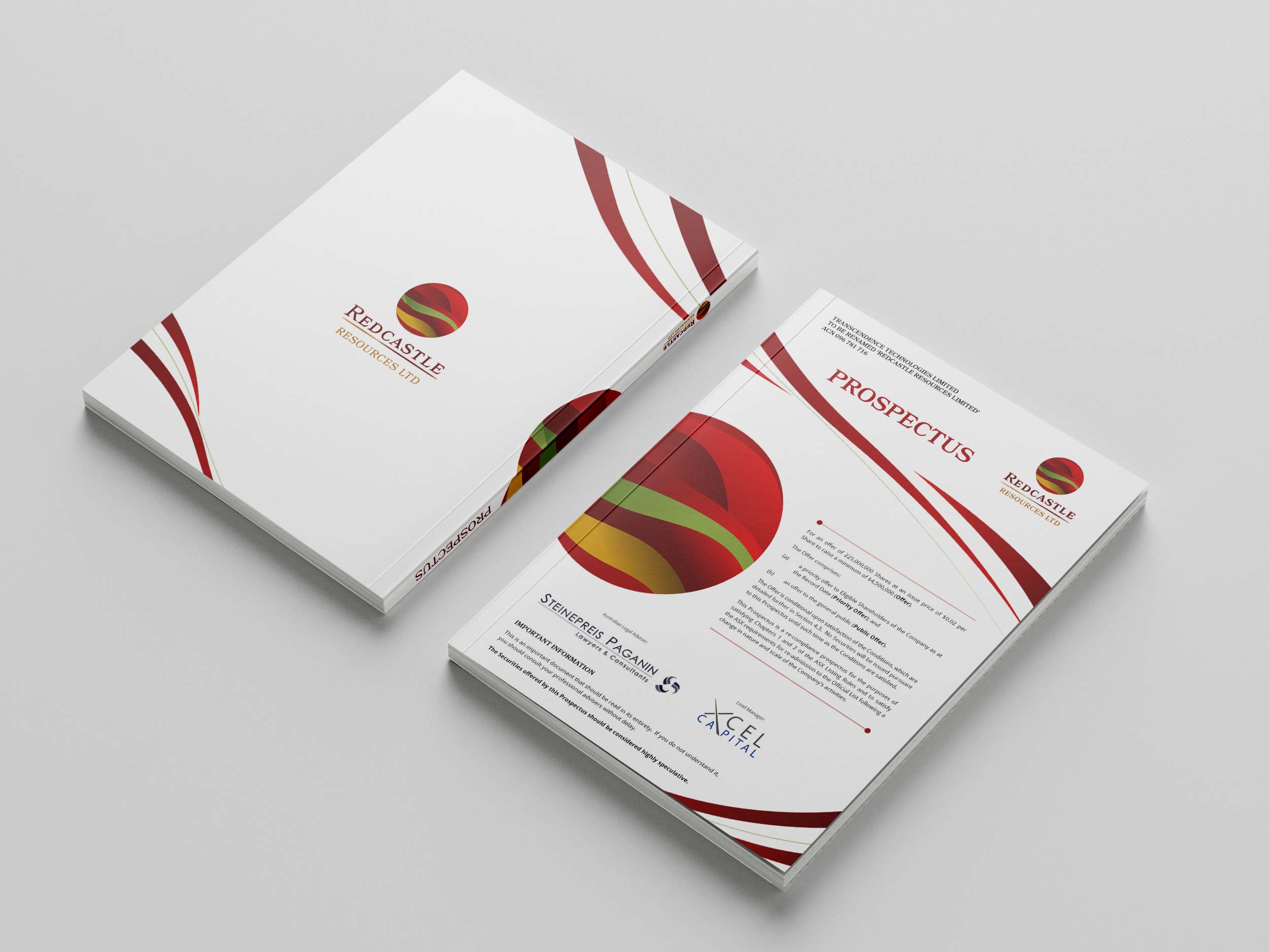
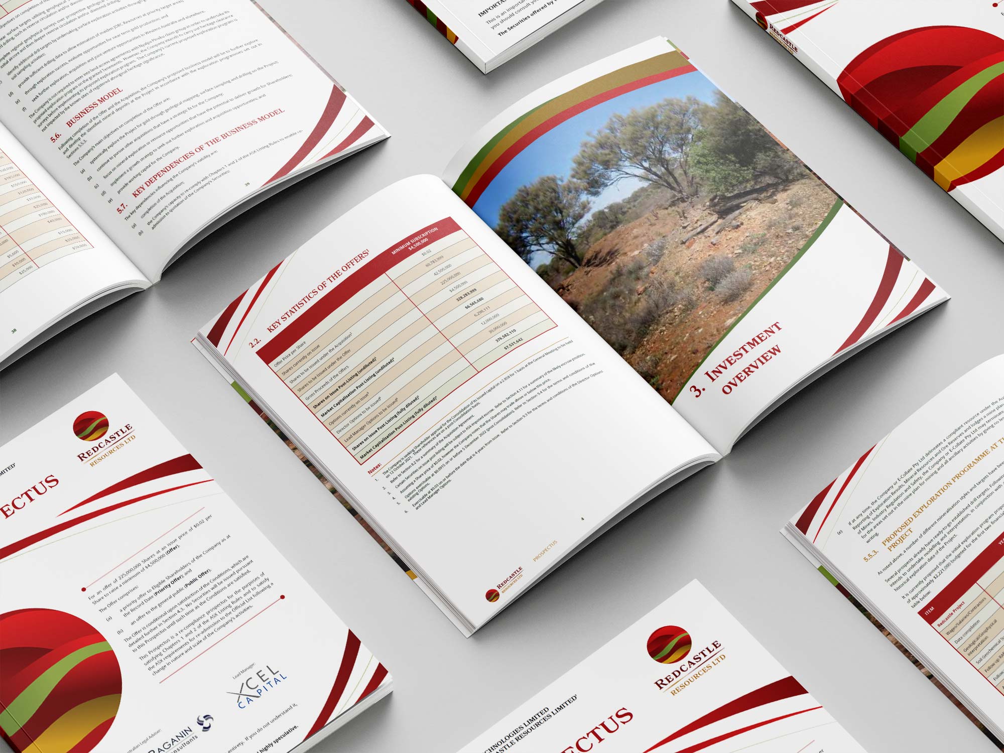
In 2021, Redcastle Resources NL (formerly Transcendence Technologies Ltd) underwent a rebranding to reflect its refocus as a gold and mineral resources exploration company, with a focus on the Redcastle Gold Project in Western Australia. The client approached me to design the new branding, starting with the logo featuring a circle representing a lens and three curved, separated colors to evoke the Australian outback’s red sand and the precious mineral resource of gold. All stationery, prospectus, and the website incorporated elements of the logo design with curves, fluid forms, and a consistent font for cohesive branding. Additionally, I designed a Power Point presentation, Word templates, and stationery for the company.